How I Built the GlowBoss Serum Campaign from Scratch (And Why It Worked)
Where I Started: Understanding the audiences
The goal was simple:
- Attract attention on Instagram and Facebook
-
Relate to the struggles of everyday skincare users
-
Communicate the benefits clearly
-
Drive quick orders with a time-limited offer
Where I Started: Understanding the People
I didn’t start with fancy words or trendy designs.
I started by thinking about the girl who’s tired of her skin breaking out, even after trying “everything.”
She’s frustrated.
She’s skeptical.
But deep down, she still wants to believe something will work.
I wrote for her.
The Ad Copy: Writing Like a Friend, Not a Salesperson
Instead of going straight into product details, I leaned into real-life struggles:
“You wash your face every day, but the pimples keep coming back. Your skin feels greasy. The spots won’t fade.”
Because sometimes, people just want to hear someone say: “I get it.”
Then I introduced GlowBoss Serum as a skin bestie — not a miracle, not a magic trick — just a real product that works.
I broke down the ingredients in a way anyone could understand:
-
Niacinamide for pimples and dark spots
-
Hyaluronic Acid for soft, fresh skin
-
Vitamin C for that natural, healthy glow
No jargon. No fluff. Just facts + benefits.
I added urgency by including a time-limited offer:
“Normally ₦20,000 — but right now, it’s just ₦15,000. Offer ends in 24 hours.”
And closed with a soft but clear CTA:
“Click the link to order now and start your glow-up journey today.”
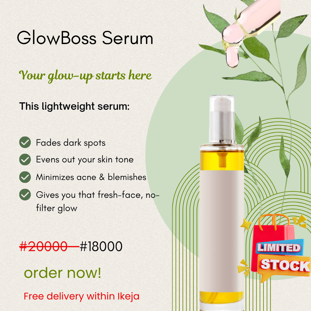
The Design: Simplicity, Trust, and Warmth
I designed the visual ad with one thing in mind: clarity.
Here’s what I focused on:
-
Clean layout so it’s easy to scan at a glance (especially on mobile)
-
Neutral tones with green accents to give a natural, fresh feel — just like the product
-
Before & After price to show the value instantly
-
Bullet points for quick benefit breakdown
-
“Limited Stock” badge to create subtle urgency
-
Free delivery in Ikeja to build local trust
I didn’t want the design to scream — I wanted it to speak calmly and confidently.
Because in skincare, people trust visuals that feel safe and authentic.
What Made the Campaign Click?
Looking back, this campaign worked because it didn’t try to be clever.
It was:
-
Honest
-
Warm
-
Clear
-
Human
I focused on the pain points, showed the solution, and made it easy to say yes.
That’s what marketing should be.
If you’re working on a beauty or skincare brand and want your campaigns to feel more human, more relatable, and more effective — I’d love to help.
Let’s build something your audience can feel.
