
Sales Landing Page for Tyg Gadget Store
Title: Driving Direct Sales for a Gadget Brand through a High-Converting Landing Page
What It’s For
This landing page was created for Tyg Gadget Store, a business that sales phone and accessories, he was running ad for quality UK-used phones he also sells too. The purpose of the project was
→ To drive immediate sales from paid ads.
The client wanted a direct and effective way to convert viewers into customers, especially through a limited-time phone + warranty offer.
Design Decisions & Thought Process
1. Why We Chose Facebook & Instagram for Ads
Before designing the landing page, we considered where the ideal buyers already spend their time.
For a gadget store targeting everyday Nigerians, especially young adults and working professionals, Facebook and Instagram stood out for three key reasons:
High engagement: These platforms have the highest number of active users in Nigeria, especially in the 20–45 age range — the group most likely to purchase used gadgets online.
Visual product appeal: Phones are visual products. Instagram and Facebook allow for rich photos, stories, and short video ads that grab attention quickly.
Easy ad conversion journey: Both platforms allow direct linking to the landing page, making the customer’s journey from scrolling to buying very smooth.
The platforms weren’t just popular — they were strategic.
Headline & Messaging
Right from the top, we used a bold promise:
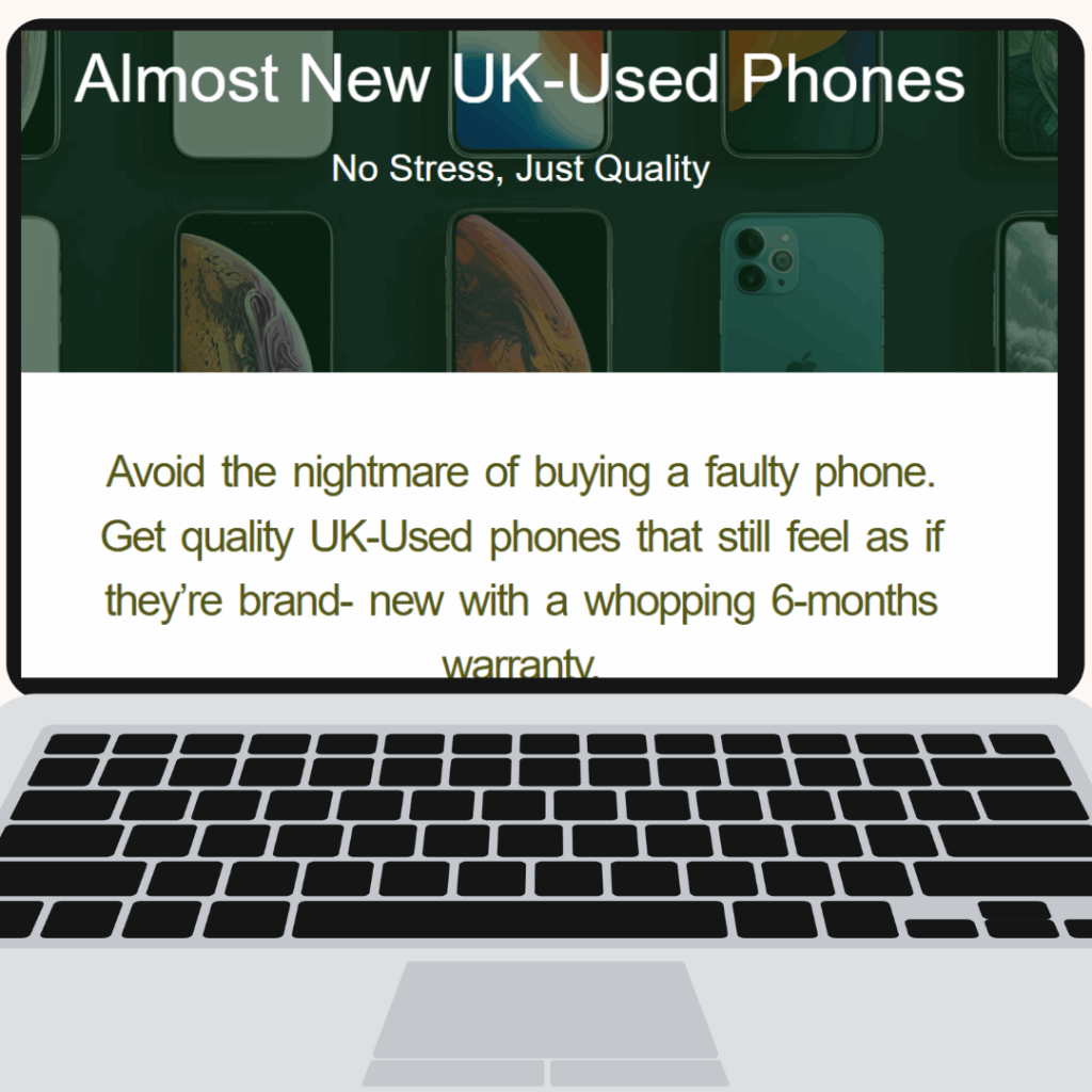
“Get Quality UK-Used Phones With Warranty!”
No fluff, no jargon — just a message that directly addresses what the buyer wants and the trust factor they’re hoping for.
Color and Font Choices
This section was designed to grab attention, build trust, and clearly communicate value — all within the first few seconds of landing on the page.
Font Choice:
I went with a bold, modern sans-serif font for the headline to create a strong first impression and ensure easy readability across all screen sizes.
Sans-serif fonts are known for their clean and approachable feel, which helps communicate clarity and confidence — both essential when presenting a high-ticket offer like UK-used phones.
Color Strategy:
Dark background behind the hero section:
This deep, muted tone adds depth and creates a premium tech feel. It helps the product images (phones) stand out while giving the section a clean, professional aesthetic.White headline text:
Using white against a dark background ensures maximum contrast and readability. It also creates an instant feeling of trust and honesty — critical when selling second-hand products.Subtext in olive green:
A softer, earthy green was chosen to evoke calmness and assurance. It gives the section a friendly, human tone while supporting the message about quality and reliability.
This subtle choice also avoids the harshness of traditional sales colors, keeping the overall vibe professional yet approachable.Important selling points (like “6-months warranty”) bolded:
Strategic bolding was used to guide the reader’s eyes to key trust-builders and offers, boosting retention of the message without using overly aggressive formatting.
Conversion Structure
Since this was made for Facebook/Instagram ads, the layout is designed to guide attention naturally:
Attention-grabbing headline
Short bullet benefits
Fast-loading product image
Strong call-to-action
Simple order form (optional add)
Trust signals (warranty, quality, fast delivery)
Final Result
This landing page became a sales engine for Tyg Gadget Store’s ad campaign. It helped:
Build instant trust with a clean, bold design
Communicate the unique offer clearly
Drive sales directly from Facebook and Instagram traffic.
If you’re looking for a landing page that doesn’t just look good but sells with strategy, this is a solid example of how it all comes together.