Lolu is a makeup artist whose work speaks for itself—but she had no online home where her potential clients could see that. She wanted something that looked beautiful, but more importantly, something that felt like her: calm, soft, trustworthy, and confident.
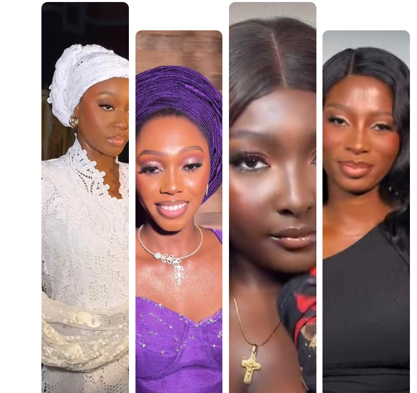
I chose a bold, professional image of a woman mid-glam session — this instantly signals what the brand offers and who it serves. The use of a makeup palette and brush in the model’s hand helps visually communicate the service.
2. Headline Strategy: Building Trust and Value
The headline “Trusted for Timeless Beauty” was deliberately crafted to communicate two key brand promises:
Trust – essential for client bookings in beauty services
Timeless Beauty – highlighting the lasting impact of Lolus Glam’s service
3. Minimal Layout, Maximum Impact
The layout was intentionally kept clean, simple, yet not plain. Every element was placed to guide, not overwhelm.
Brand Name:Glam’s Beauty Touch is positioned upfront to build instant recognition and set the tone.
Call-to-Action: A clear “Book an Appointment” button provides visitors with a direct next step, eliminating distractions.
About Section (On the Same Page): Instead of sending users elsewhere, I included a short About section right on the homepage, so they get a feel for the person behind the brand while staying in flow.
Visual Hierarchy: I used spacing, font size, and structure to gently guide the eye from top to bottom, keeping the experience smooth and focused.
4. Color Palette & Mood
I chose a clean, neutral background to let the bold colors of the makeup and model pop. This contrast emphasizes professionalism, glamour, and focus, aligning with the preferences of the target audience, women who value beauty and luxury.
5. Client-Centered Message Flow
Every section was built to answer:
“Why should I book Lolus Glam?” The combination of credibility-focused messaging and striking design ensures visitors see the brand as premium, experienced, and worth trusting.
Outcome
This design gives Lolus Glam a strong, branded presence, positioning them to: