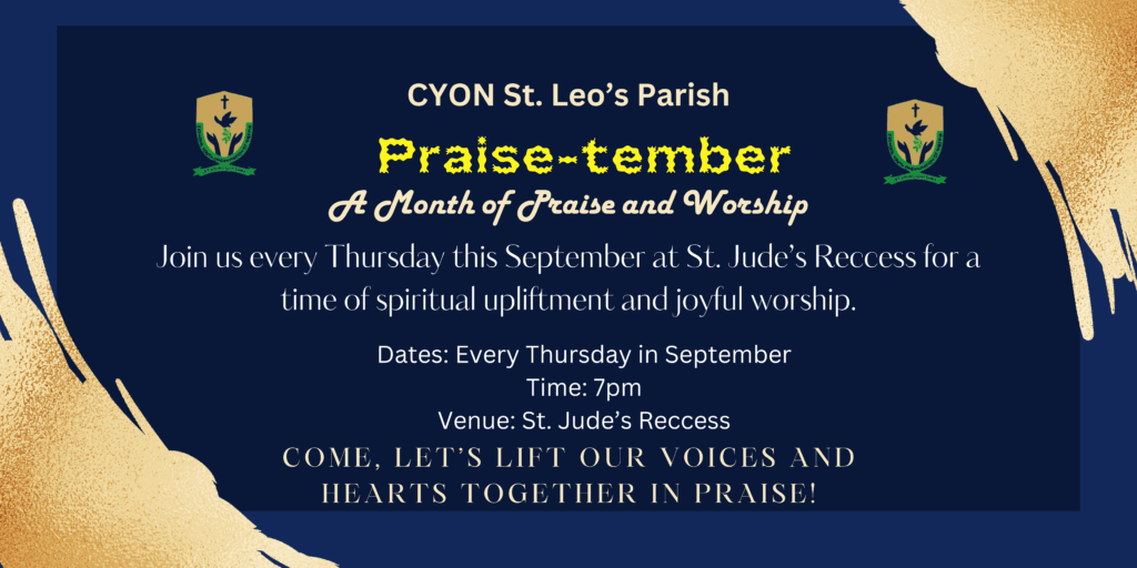
Event Flyer Design for CYON St. Leo’s Parish
Design Objective
The focus was to create a flyer that:
Felt inviting and uplifting
Had a clear structure for easy reading
Matched the tone of a youth-led worship event
Stood out while staying appropriate for a church setting
Design Process
1. Color Palette & Mood
I chose a deep navy blue background to convey calmness, depth, and reverence—balanced by golden brush textures to add a sense of celebration and energy. The combination brought both elegance and youthfulness to the design.
2. Typography
I used a mix of bold display fonts (for “Praise-tember”) and elegant serif/sans-serif fonts for the body text. This helped build a visual hierarchy—drawing attention first to the event name, then smoothly guiding the reader through the details.
3. Layout & Clarity
Information was kept centered and clean to avoid clutter.
Key event details—date, time, and venue—were clearly listed and easy to scan.
The final call-to-action (“COME, LET’S LIFT OUR VOICES AND HEARTS TOGETHER IN PRAISE!”) was styled to feel inviting and communal.
Tools Used
Canva for layout, font pairing, background effects, and image composition.
